
Visual Literacy project
Keyless car fob design taking inspiration from Joseph & Joseph kitchen products brand analysis
Brief
For this visual literacy project we were assigned a brand and had to redesign a remote control based on the brand language. Our tasks included researching the brand, compiling 30 x A1 pages of sketches, and producing a CMF board to imagine and justify our design choices.
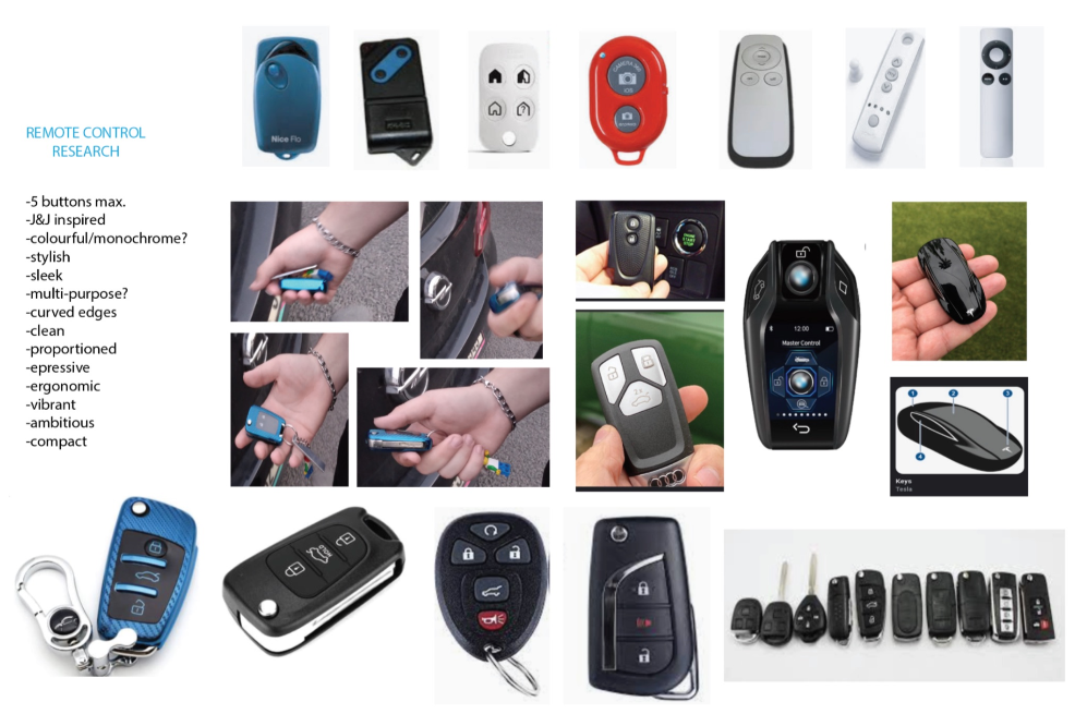
Research
For my Visual Literacy project I was assigned the brand Joseph & Joseph (J&J). I began to look at their products with softer colour range and proportioned curves.
Joseph & Joseph is a brand that puts consumers first and is big on functionality striving to make their products high quality and long lasting. J&J use softer, pastel tones of blue, pink & grey to provide a calmer look combined with soft silicone & nylon finishes to ensure their product is durable yet nice to hold.
I chose to design a car key fob based on their design language and aimed at creative consumers who also appreciate functionality and would therefore be interested in a colourful key fob rather than plain black ones as already seen across the market. The fob would need to be durable as its prone to being dropped yet soft enough to comfortably hold in the hand and small enough to fit into the hand or pocket.

Concepts
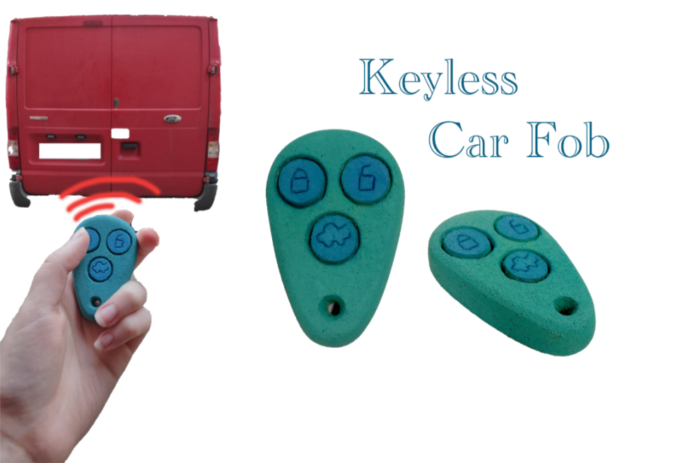
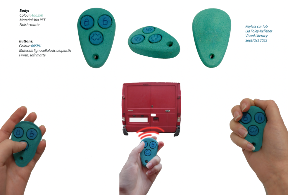
I originally decided to make the car fob keyless and include three main buttons: one to lock, one to unlock the car & one to unlock the boot as well as an alarm button.
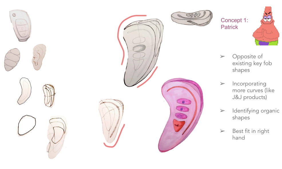
Concept one is shaped quite different from the usual key fob as I designed it based off organic shapes and exaggerating the curves of J&J products. It is decorated using analogous colours and is unfortunately only truly suited to the right hand and is quite big for its function.
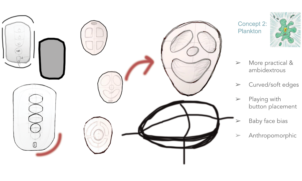
Concept two was intended to be more rectangular but I decided to make it more curved and inspired by J&J once again while also making it ambidextrous. I was strongly influenced by the baby face bias and therefore designed a very anthropomorphic fob which could be seen as slightly over bearing.
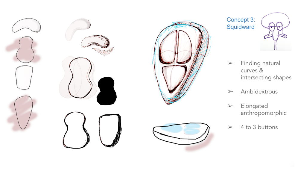
With concept three I returned to looking at organic shapes such as kidney beans however when I sculpted it I found that the model with two divots on either side didn't fit very comfortably or naturally in the hand and therefore kept working on the form based making it fit the hand more so than the hand forcibly fitting the form. Therefore I ended up with a more elongated curved shape while still keeping the anthropomorphic shape in mind. I also moved from four buttons down to three, removing the alarm button.
Development
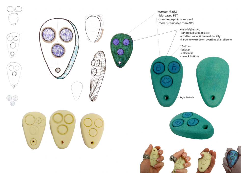
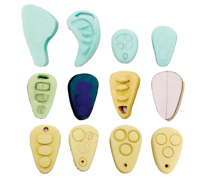
I developed concept three further for my final product. I made this ambidextrous curved shape minimising the anthropomorphic feel while still evoking the bias. I kept words in mind that I believe describe both J&J products and come to mind when consumers see my key fob design - these being curved, proportioned, comfortable, inviting, clean and sensible, deliberate design - things I've followed throughout my conceptualisation.
Outcome
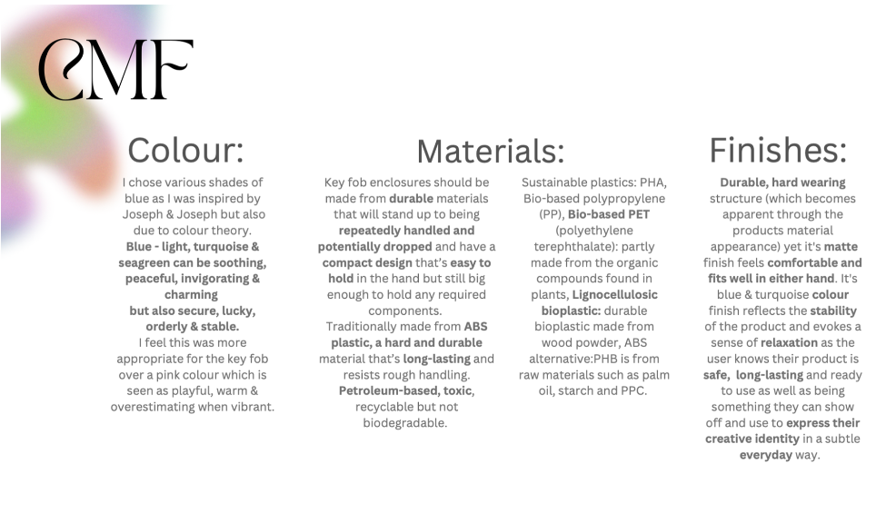
My reason for the colouring of this product is that I was very much inspired by J&J's bottle design and when deciding between various shades of blue or pink I found out that colours such as light blue, blue, turquoise and seagreen are seen as soothing, peaceful, invigorating & charming as well as lucky, secure, orderly & stable which is what I wanted my product to represent.
While researching materials I learned that car key fobs are traditionally made using ABS plastic which is toxic petroleum-based therefore keeping the product long lasting & durable like J&J's ethos but also sustainable I decided that using Bio based PET & lignocellulosic bioplastic would achieve this outcome & not harm the planet or the user. Overall helping achieve a comfortable matte finish for this durable, safe, hard wearing product.
Final thoughts
I'm quite satisfied with this product's outcome knowing that the colourful compact keyless car fob will allow the user to express their creative identity and gain a sense of self satisfaction and independence as they can use this sustainable everyday item to conveniently hop in their car and drive wherever they want. If I were to have more time on this project I would create a broader colour range and possibly create more complex, creative shapes however I felt that would stray away from J&J’s brand identity and would be more difficult to remain ambidextrous.